OK. Thank you to everyone who voted on the book covers in the last few weeks.
In addition to comments on the blog, I had lots of emails, votes on the official voting page, and comments on Facebook. In all, about 55% prefer the first book cover (with icons; without a guy looking off a building).
There was some discussion the the icons looked old school but I never got good feedback on whether that's good or bad. I also got a few comments that they looked modern and new. I don't know enough about icons to understand the discussion.
Anyway, it looks like Cover A is the favorite. But since I had Sally start working on another design, I thought I'd throw it out there as well.
Personally, I didn't like the dark gray on Option A, so here are four options to choose from:
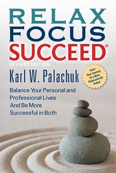
Option 1 A is the original.
Option 1B is a lighter color (blue). Sally will choose the actual color.
Option 1C is black, which I somehow like more than dark gray.
Option 3 is the totally different cover.
Maybe none of this matters given the cover artwork I see on Amazon - and the fact that my book will probably never actually be in a book store. But I appreciate your feedback!
Thank you.
:-)
In addition to comments on the blog, I had lots of emails, votes on the official voting page, and comments on Facebook. In all, about 55% prefer the first book cover (with icons; without a guy looking off a building).
There was some discussion the the icons looked old school but I never got good feedback on whether that's good or bad. I also got a few comments that they looked modern and new. I don't know enough about icons to understand the discussion.
Anyway, it looks like Cover A is the favorite. But since I had Sally start working on another design, I thought I'd throw it out there as well.
Personally, I didn't like the dark gray on Option A, so here are four options to choose from:
Option 1 A is the original.
Option 1B is a lighter color (blue). Sally will choose the actual color.
Option 1C is black, which I somehow like more than dark gray.
Option 3 is the totally different cover.
Maybe none of this matters given the cover artwork I see on Amazon - and the fact that my book will probably never actually be in a book store. But I appreciate your feedback!
 |
| Please Click to Vote! |
Thank you.
:-)


No comments:
Post a Comment
Feedback Welcome
Please note, however, that spam will be deleted, as will abusive posts.
Disagreements welcome!